In this tutorial we'll learn how to create an animated quotebook. Check out a live demo of the application here: randomquotebook.surge.sh.
Road Map
- Understand and use create-react-app as a boilerplate.
- Create a function to shuffle the array of available quotes each time the application refreshes.
- Create "Next" and "Back" buttons to allow users to navigate through the quotes.
- Add transition animations using react-css-transition-replace.
- Build and deploy the app using surge.sh.
Getting Started with create-react-app
This tutorial assumes a working knowledge of Node.js and npm. Check out Alexandru Vladutu's Step-by-Step Node.js tutorial if you are unfamiliar.
Once you have Node and npm installed, we're ready to get started.
Facebook's create-react-app boilerplate project is a convenient way to start new React SPA projects. It takes care of a lot of the grunt work that comes with setting up a React app. Read more about it here if you are interested.
Now from the command line, install the create-react-app npm package globally:
npm install -g create-react-app
Now, in a directory of your choosing, create a new app:
create-react-app quotebook
This might take a minute or two to complete. After it completes, cd into the new project and save immutable and react-css-transition-replace, two npm packages we'll use later:
cd quotebook-tutorial
npm i --save immutable react-css-transition-replace
After those finish installing, you can start up the app by running:
npm start
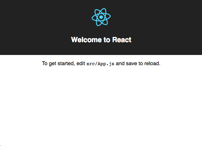
This will start a development server at localhost:3000. Open up your browser and check it out. It should look like this.
Explore the create-react-app project structure a little bit. The most important files to note are:
src/App.js: what you actually make edits to.src/index.js: handles the call to ReactDOM to render the entire<App />in the "root" div.public/index.html: the html page onto which the app is rendered.
Add Bootstrap and Google Fonts
In the head of public/index.html add the following lines:
<link
  rel="stylesheet"
  href="https://maxcdn.bootstrapcdn.com/bootstrap/3.3.7/css/bootstrap.min.css"
  integrity="sha384-BVYiiSIFeK1dGmJRAkycuHAHRg32OmUcww7on3RYdg4Va+PmSTsz/K68vbdEjh4u"
  crossorigin="anonymous"
/>
<link href="https://fonts.googleapis.com/css?family=Arvo:400,700|Open+Sans" rel="stylesheet" />
These additions allow use of Bootstrap CSS styles and Google Font's Arvo and Open Sans.
Component Level Design
No matter how simple the project, it's always helpful to look at a component-level design of the application.
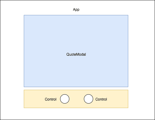
Nothing too surprising here. Aside from the App-level component, we'll only need two additional components: QuoteModal and Control.
Create the QuoteModal Component
The QuoteModal component will handle display each quote and author with proper styling.
Within the src folder of the project, create a new directory called components, and within that directory, create two new files, QuoteModal.js and styles.css. Now within the QuoteModal.js file add the following code:
import React, { Component } from 'react'
import './styles.css'

class QuoteModal extends Component {
  render() {
    return (
      <div className="quote-modal text-center">
        <p className="quote-text">"{this.props.quote}"</p>
        <hr />
        <p>- {this.props.author}</p>
      </div>
    )
  }
}

export default QuoteModal
And within the styles.css file add the following code:
.quote-modal {
  font-family: 'Open Sans', sans-serif;
  font-size: 16px;
  padding: 20px;
  border-radius: 3px;
  margin: auto;
  width: 95%;
  height: auto;
  background-color: #fff;
  box-shadow: 2px 2px 5px #9e9e9e;
}

.quote-text {
  line-height: 1.5;
}

@media only screen and (min-width: 768px) {
  .quote-modal {
    width: 500px;
    font-size: 18px;
  }
}
Let's understand what's going on in the code above. First, in the QuoteModal.js file:
-
Importing the default export from
'react'under the nameReact, and we're importing the named exportComponentunder the same name. See this StackOverflow post for more on import syntax. -
Importing our newly created stylesheet
styles.css. -
Declare the QuoteModal component using an ES6 class, and define it's
render()method, the only method required to implement a valid React component. Within the render method, thequoteandauthorprops are styled appropriately in paragraph tags, and the entire thing is wrapped in a div. -
Export the QuoteModal class so it can be used within the
App.jsfile later.
Now within the styles.css file:
- Define the QuoteModal CSS class, which is mobile-optimized. The media query handles checking if the user is on a desktop or tablet, in which case we provide a static width of 500px for the modal and increase the font size.
Create the Control Component
The Control component will allow us to create our "Back" and "Next" controls. This article provides a simple, straightforward way to implement icons using inline SVGs; the code below is a simplified version of their example Icon component. Bonus: the article also provides a ton of icons for free use! We'll be using the "arrow-back" and "arrow-forward" SVGs.
Within the components folder, create a file called Control.js and add the following code:
import React, { Component } from 'react'

class Control extends Component {
  renderGraphic() {
    switch (this.props.icon) {
      case 'arrow-back':
        return (
          <g>
            <path d="M20 11h-12.17l5.59-5.59-1.42-1.41-8 8 8 8 1.41-1.41-5.58-5.59h12.17v-2z"></path>
          </g>
        )
      case 'arrow-forward':
        return (
          <g>
            <path d="M12 4l-1.41 1.41 5.58 5.59h-12.17v2h12.17l-5.58 5.59 1.41 1.41 8-8z"></path>
          </g>
        )
    }
  }

  render() {
    const sx = {
      fill: '#FFF',
    }

    return (
      <svg
        onClick={this.props.onClickFunction}
        style={sx}
        width={this.props.width}
        height={this.props.height}
        viewBox="0 0 24 24"
      >
        {this.renderGraphic()}
      </svg>
    )
  }
}

export default Control
Again, let's make sure we understand what's going on above:
TherenderGraphic()method decides which SVG to dispay, based on the "icon" prop passed in to the component. Since our application only has two potential icons, "arrow-back" and "arrow-forward", we only define cases for those.
The render() method returns an styled svg element. The width, height and onClick function are passed to the component as props and are used here. Note: you could add additional styles to the sx object if you so choose.
Use the Components within App.js
Time to strip the boilerplate code out of App.js and add in the newly created QuoteModal and Control components.
Within App.js add the following code:
import React, { Component } from 'react'

import QuoteModal from './components/QuoteModal'
import Control from './components/Control'

import './App.css'

class App extends Component {
  constructor(props) {
    super(props)
    this.state = {}
  }

  render() {
    return (
      <div className="App">
        <div className="App-header">
          <h2>Quotebook</h2>
        </div>

        <QuoteModal key={1} quote={'Test Quote'} author={'Test Author'} />

        <div className="control-section">
          <div className="control-container">
            <Control
              className="inline-control"
              width={'40'}
              height={'40'}
              icon={'arrow-back'}
              onClickFunction={() => {
                console.log('back button clicked')
              }}
            />
          </div>
          <div className="control-container">
            <Control
              className="inline-control"
              width={'40'}
              height={'40'}
              icon={'arrow-forward'}
              onClickFunction={() => {
                console.log('next button clicked')
              }}
            />
          </div>
        </div>
      </div>
    )
  }
}
And within App.css add the following classes:
body {
  height: 100%;
  background-color: #124563;
}

.App {
  text-align: center;
  display: block;
  overflow: auto;
  height: 100vh;
}

.App-header {
  font-family: 'Arvo', serif;
  height: 100px;
  padding: 20px;
  color: #fff;
}

.control-section {
  text-align: center;
  padding: 20px;
  margin: auto;
  display: block;
}

.control-container {
  display: inline-block;
  border-radius: 58%;
  padding: 5px;
  margin: 0px 30px 0px 30px;
  transition: background-color 0.5s ease-in;
}

.control-container:active {
  background-color: #fff;
}
Save both files, and check out the app on localhost. It should look similar to this:
Understanding the additions to App.js:
Import our QuoteModal and Control components. Definition of the constructor() function, which we'll use later. Definition of the render() method. The QuoteModal component takes two example strings in as props. Below that, the controls section. Two Control components are defined here, the first for the Back button and the second for the Next button (as specified by their icon props). Each Control has a dummy function passed in for the onClickFunction prop, which just logs the click to the console.
Add Real Quotes
With the components working correctly, it's time to introduce real quotes. Two options here.
- Use the quotes file I've created, available on the Github repo for this project.
- Create your own quotes.js file, making sure to match the format shown in the linked file above.
Whichever you choose, save the resulting quotes.js file in the src directory. And add the following lines to the top of App.js:
import { List } from 'immutable'
import quotes from './quotes'
And now we'll update the constructor function with the following code:
  constructor(props){

    super(props)

    const the_quotes = List(quotes)
    const init = the_quotes.get(0)

    this.state = {
      quote: init.quote,
      author: init.author,
      available_quotes: the_quotes,
      index: 0
    }
  }
I've opted to use Immutable.js here to create a List from the array of quotes. Is it really necessary to use immutable data structures here? Not really. But the List structure is easy and convenient to use and I've wanted to check out this project for a while. Check out this talk if you want to learn more about immutable data.
Beyond that, we are defining state variables for the App-level component. The first quote from the List is used to populate the quote and author variables. The the_quotes variable is assigned to available_quotes and we initialize the index variable to 0, which will be used within the onClickFunctions for the controls.
Update the code for the QuoteModal within the render() function to make use of the newly defined quote and author variables:
...
    <QuoteModal key={1} quote={this.state.quote} author={this.state.author} />
...
Save the changes to App.js and check out the browser, it should be displaying this quote:

Create onClick functions for Back and Next Controls
Users should be able to use the Back and Next controls to navigate through the collection of quotes. To accomplish this, the index variable defined earlier comes into play.
Let's think about how we would use index to implement the next and back buttons. A naive implementation to start, which includes a helper function performUpdate():
  performUpdate(){
    const nq = this.state.available_quotes.get(this.state.index)
    this.setState({
      quote: nq.quote,
      author: nq.author,
    })
  }

  handleBackButton(){
      this.setState({
        index: this.state.index - 1
      }, this.performUpdate)
  }

  handleNextButton(){
      this.setState({
        index: this.state.index + 1
      }, this.performUpdate)
  }
What's going on here? We've defined two handler functions, handleBackButton and handleNextButton which makes a call to React component method setState, decrementing and incrementing the index variable, respectively. And then we provide the performUpdate method as a callback to be executed after this update to the index variable goes through.
The reasoning for this is laid out in the React Docs:
"Think of
setState()as a request rather than an immediate command to update the component. For better perceived performance, React may delay it, and then update several components in a single pass. React does not guarantee that the state changes are applied immediately.
setState()does not always immediately update the component. It may batch or defer the update until later. This makes readingthis.stateright after callingsetState()a potential pitfall. Instead, usecomponentDidUpdateor asetStatecallback (setState(updater, callback)), either of which are guaranteed to fire after the update has been applied. If you need to set the state based on the previous state, read about the updater argument below."
Using the callback parameter works well here because performUpdate is dependent on the index either incrementing or decrementing in order to load a new quote and author.
What if a user immediately hits the back button after launching the page? Won't that decrement the counter to -1? *Yes it will. That's OK though, because Immutable.js List indices may be negative. Therefore we can support this interaction by default.
That makes sense... but there's still a problem. Say you only had 5 quotes total. And a user immediately starts hitting the back button, -1, -2, -3, -4, -5... -6? Shit! Trying to get(-6) on a list of size 5 will break the app. We need to guard against this, and reset the counter upon reaching the absolute value of the size of the quotes array being used. Make a few small additions to the increment and decrement functions:
  handleBackButton(){
    if(this.state.index === -(this.state.available_quotes.size - 1)){
        this.setState({
          index: 0
        }, this.performUpdate)
    } else {
        this.setState({
          index: this.state.index - 1
        }, this.performUpdate)
    }
  }

  handleNextButton(){
    if(this.state.index === (this.state.available_quotes.size - 1)){
        this.setState({
          index: 0
        }, this.performUpdate)
    } else {
        this.setState({
          index: this.state.index + 1
        }, this.performUpdate)
    }
  }
Nice. The if statements turn our List into a circular list, and we'll never have to worry about an invalid indice being generated by the user.
The Shuffle Function
It's boring to see the same order of quotes each time. Let's fix this by adding an in-place shuffle function to the constructor. A quick search on StackOverflow tells us that the Fisher-Yates shuffle is a good candidate for this. Check out this awesome post and visualization of the algorithm if you want to learn more. Within App.js, add the following function:
  shuffleQuotes(arr){
    let curIndex = arr.length, tempVal, randIndex

    while(0 !== curIndex){
      //pick remaining element
      randIndex = Math.floor(Math.random() * curIndex)
      curIndex -= 1

      //swap with current
      tempVal = arr[curIndex]
      arr[curIndex] = arr[randIndex]
      arr[randIndex] = tempVal
    }

    return arr
  }
And now, modify the constructor to make use of the new shuffle function:
  constructor(props){
    super(props)

    //randomize order of quotes at start of session
    const shuffled = List(this.shuffleQuotes(quotes))
    const init = shuffled.get(0)

    this.state = {
      quote: init.quote,
      author: init.author,
      available_quotes: shuffled,
      index: 0
    }
  }
Great! Refresh the app and click around to test it out. The quotes will shuffle each time the user refreshes the app.
Selecting Random Background Color
Let's make things a little more visually appealing by having the background color change each time a new quote loads.
Within the src folder create a new file colors.js and within it add the following code:
module.exports = ['#703030', '#2F343B', '#7E827A', '#E3CDA4', '#C77966']
The colors above are from the Vintage Ralph Lauren Color Theme on Adobe Kuler. You can find another theme there if you want, or just choose random colors. Add as many as you like. Alternative method: create a function that generates a random hex color string and use that within the render method of the App. Note that you'll probably have to guard against generating white/off-white colors because the Back and Next buttons won't be visible.
Within App.js, import the new colors.js file:
import colors from './colors'
Modify the constructor function one more time:
  constructor(props){
    super(props)

    const shuffled = List(this.shuffleQuotes(quotes))
    const init = shuffled.get(0)

    const bgcolors = List(colors)

    this.state = {
      quote: init.quote,
      author: init.author,
      available_quotes: shuffled,
      colors: bgcolors,
      index: 0
    }
  }
Add a helper function to select a random color from the array:
  getRandomColor(){
    let ind = Math.floor(Math.random() * this.state.colors.size)
    return this.state.colors.get(ind)
  }
And last, make use of this new function in the render method:
render() {

    const bgcolor = this.getRandomColor()
    const container_style  = {
      backgroundColor: bgcolor,
      transition: 'background-color 1s ease'
    }

    return (
      <div className="App" style={container_style}>
        <div className="App-header">
          <h2 className="animated fadeIn">Quotebook</h2>
        </div>
        ...
Refresh the app and click around to see the new background colors in action. The transition CSS attribute comes in handy here, allowing for smoother transitions between background colors.
Adding Animations
Let's animate the transition between quotes in a similar way to how the background color transitions. If only there was an open source component that animates replacing one element with another... like react-css-transition-replace!. As its README notes, there are some nice advantages to using this component:
- It automatically handles the positioning of the animated components, and
- allows changes in the height of container to be handled and animated with ease when various content heights differ, even when absolute positioning is used.
That really comes in handy here because of the variable length of each quote. Let's add it in. We already took care of installing the react-css-transition-replace npm package at the start of the project; import into App.js now:
We'll use the cross-fade transition as shown in the first example on the README. Add the following styles to App.css:
.cross-fade-leave {
  opacity: 1;
}

.cross-fade-leave.cross-fade-leave-active {
  opacity: 0;
  transition: opacity 1s ease-in;
}

.cross-fade-enter {
  opacity: 0;
}

.cross-fade-enter.cross-fade-enter-active {
  opacity: 1;
  transition: opacity 1s ease-in;
}

.cross-fade-height {
  transition: height 1s ease-in-out;
}
And now let's use the component within App.js. Import it:
import ReactCSSTransitionReplace from 'react-css-transition-replace'
And modify the render method to use it:
  render() {

    const bgcolor = this.getRandomColor()
    const container_style  = {
      backgroundColor: bgcolor,
      transition: 'background-color 1s ease'
    }

    return (
      <div className="App" style={container_style}>
        <div className="App-header">
          <h2 className="animated fadeIn">Quotebook</h2>
        </div>

        <ReactCSSTransitionReplace transitionName="cross-fade" transitionEnterTimeout={1500} transitionLeaveTimeout={1500} >
          <QuoteModal key={this.state.quote} quote={this.state.quote} author={this.state.author} />
        </ReactCSSTransitionReplace>

        <div className="control-section">
          <div className="control-container">
            <Control width={"40"} height={"40"} icon={"arrow-back"} onClickFunction={this.handleBackButton.bind(this)} className="inline-control" />
          </div>
          <div className="control-container">
            <Control width={"40"} height={"40"} icon={"arrow-forward"} onClickFunction={this.handleNextButton.bind(this)} className="inline-control" />
          </div>
        </div>
      </div>
    );
  }
Refresh the app and try out the new animation.
Reviewing App.js
Boom! You're done. Here is the App.js file in its final form:
import React, { Component } from 'react'
import ReactCSSTransitionReplace from 'react-css-transition-replace'
import { List } from 'immutable'

import QuoteModal from './components/QuoteModal'
import Control from './components/Control'

import './App.css'

import quotes from './quotes'
import colors from './colors'

class App extends Component {
  constructor(props) {
    super(props)

    const shuffled = List(this.shuffleQuotes(quotes))
    const init = shuffled.get(0)

    const bgcolors = List(colors)

    this.state = {
      quote: init.quote,
      author: init.author,
      available_quotes: shuffled,
      colors: bgcolors,
      index: 0,
    }
  }

  // https://stackoverflow.com/questions/2450954/how-to-randomize-shuffle-a-javascript-array
  shuffleQuotes(arr) {
    let curIndex = arr.length,
      tempVal,
      randIndex

    while (0 !== curIndex) {
      //pick remaining element
      randIndex = Math.floor(Math.random() * curIndex)
      curIndex -= 1

      //swap with current
      tempVal = arr[curIndex]
      arr[curIndex] = arr[randIndex]
      arr[randIndex] = tempVal
    }

    return arr
  }

  getRandomColor() {
    let ind = Math.floor(Math.random() * this.state.colors.size)
    return this.state.colors.get(ind)
  }

  performUpdate() {
    const nq = this.state.available_quotes.get(this.state.index)
    this.setState({
      quote: nq.quote,
      author: nq.author,
    })
  }

  handleBackButton() {
    // guard against users who start scrolling backwards immediately
    // and miraculously make it all the way through to the end of the array
    if (this.state.index === -(this.state.available_quotes.size - 1)) {
      this.setState(
        {
          index: 0,
        },
        this.performUpdate
      )
    } else {
      this.setState(
        {
          index: this.state.index - 1,
        },
        this.performUpdate
      )
    }
  }

  handleNextButton() {
    // guard against reaching end of quotes array and having to "wrap back around"
    if (this.state.index === this.state.available_quotes.size - 1) {
      this.setState(
        {
          index: 0,
        },
        this.performUpdate
      )
    } else {
      this.setState(
        {
          index: this.state.index + 1,
        },
        this.performUpdate
      )
    }
  }

  render() {
    const bgcolor = this.getRandomColor()
    const container_style = {
      backgroundColor: bgcolor,
      transition: 'background-color 1s ease',
    }

    return (
      <div className="App" style={container_style}>
        <div className="App-header">
          <h2 className="animated fadeIn">Quotebook</h2>
        </div>

        <ReactCSSTransitionReplace
          transitionName="cross-fade"
          transitionEnterTimeout={1500}
          transitionLeaveTimeout={1500}
        >
          <QuoteModal key={this.state.quote} quote={this.state.quote} author={this.state.author} />
        </ReactCSSTransitionReplace>

        <div className="control-section">
          <div className="control-container">
            <Control
              width={'40'}
              height={'40'}
              icon={'arrow-back'}
              onClickFunction={this.handleBackButton.bind(this)}
              className="inline-control"
            />
          </div>
          <div className="control-container">
            <Control
              width={'40'}
              height={'40'}
              icon={'arrow-forward'}
              onClickFunction={this.handleNextButton.bind(this)}
              className="inline-control"
            />
          </div>
        </div>
      </div>
    )
  }
}

export default App
Prepare to Deploy
Let's build the app for production. This is super easy. From the command line, in the base directory of the project, run:
npm run build
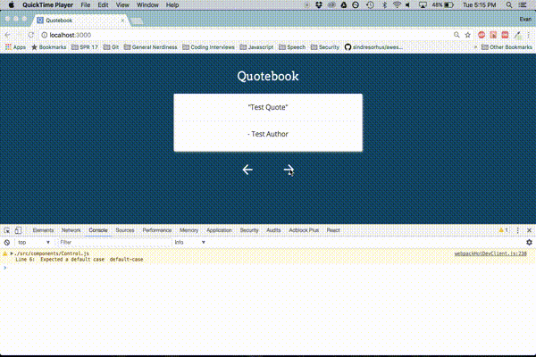
Simple as that. After the build completes you should see a message like this in your terminal:
evannichols:_Dev/quotebook ‹master*›$ npm run build

> quotebook@0.1.0 build /Users/evannichols/_Dev/quotebook
> react-scripts build

Creating an optimized production build...
Compiled with warnings.

./src/components/Control.js
  Line 6:  Expected a default case  default-case

Search for the keywords to learn more about each warning.
To ignore, add // eslint-disable-next-line to the line before.

File sizes after gzip:

  75.73 KB  build/static/js/main.e46c105f.js
  524 B     build/static/css/main.37e0d7c2.css

The project was built assuming it is hosted at ./.
You can control this with the homepage field in your package.json.

The build folder is ready to be deployed.
Deploy using Surge
It's time to share your quotebook with the world! If you want. Surge is a ruthlessly simple way to deploy static apps/websites. First, install the surge npm package globally:
npm install -g surge
If you would like to use a custom domain name (like mycoolquotebook.surge.sh or supercoolquotes.surge.sh) you'll need to add a CNAME into your build folder. Note that the domain must end in .surge.sh. If you don't care about the domain name you can skip this step; surge will automatically generate a random name for you. From the command line, cd into the build folder and run:
echo <YourCustomDomainName>.surge.sh > CNAME
Now, in the base directory of your project run:
surge
This will then prompt you to specify your project path. Since we want to deploy the build folder, make sure to add that to the project path. Finally, hit enter, and let surge do the rest! It should look something like this:
evannichols:_Dev/quotebook ‹master*›$ surge

    Surge - surge.sh

              email: evantnichols@gmail.com
              token: *****************
       project path: /Users/evannichols/_Dev/quotebook/build
               size: 10 files, 2.4 MB
             domain: randomquotebook.surge.sh
             upload: [====================] 100%, eta: 0.0s
   propagate on CDN: [====================] 100%
               plan: Free
              users: evantnichols@gmail.com
         IP Address: 45.55.110.124

    Success! Project is published and running at <YourCustomDomainName>.surge.sh
Go check out your quotebook live!
Update (7/11/17): It is possible to automate the deployment process by editing the deploy script in the project's package.json file:
"deploy": "echo <YourCustomDomainName>.surge.sh > build/CNAME && surge build"
I hope you enjoyed creating your very own quotebook. Questions, comments, issues with the tutorial? Shoot me an email at evantnichols@gmail.com.